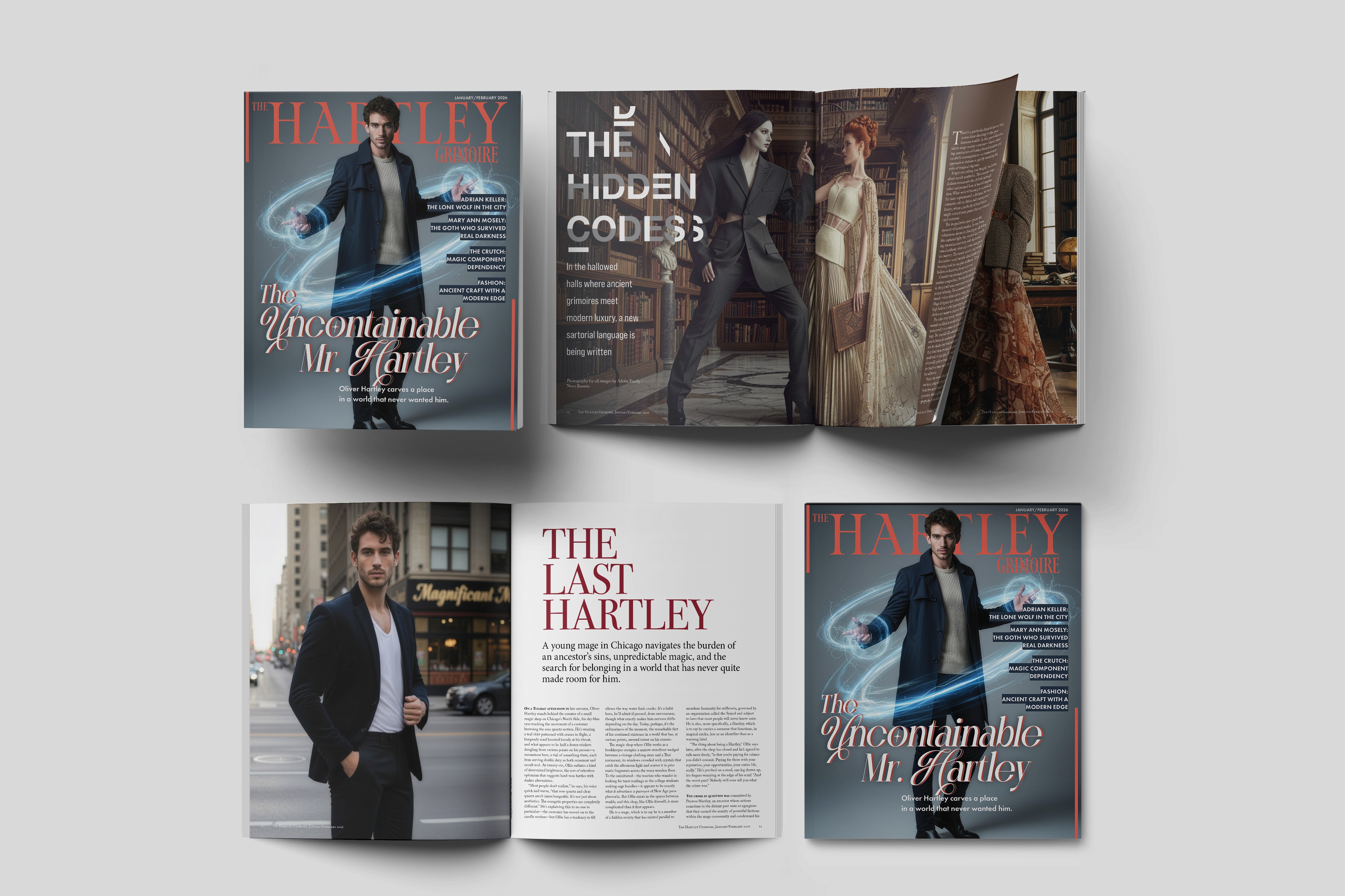
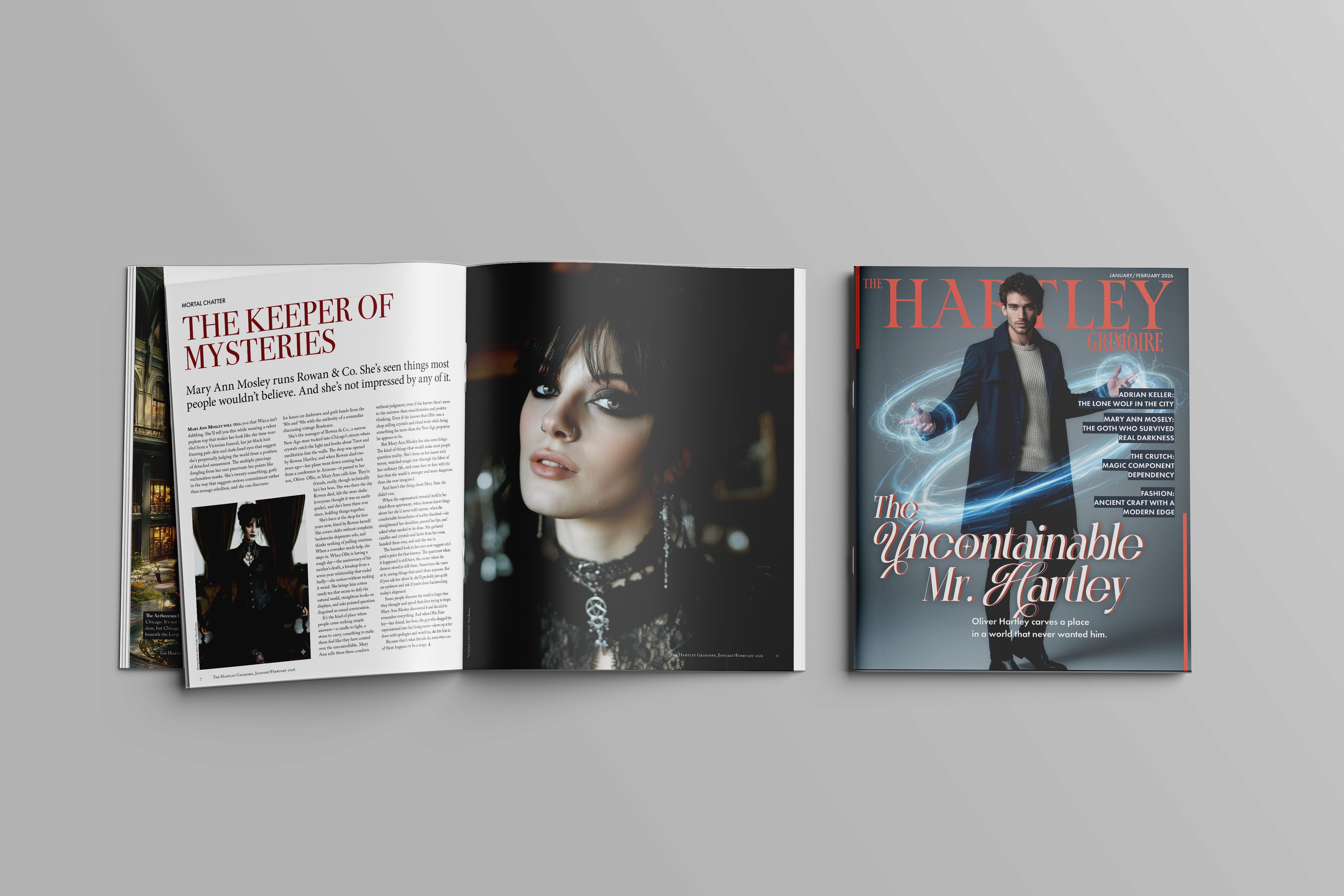
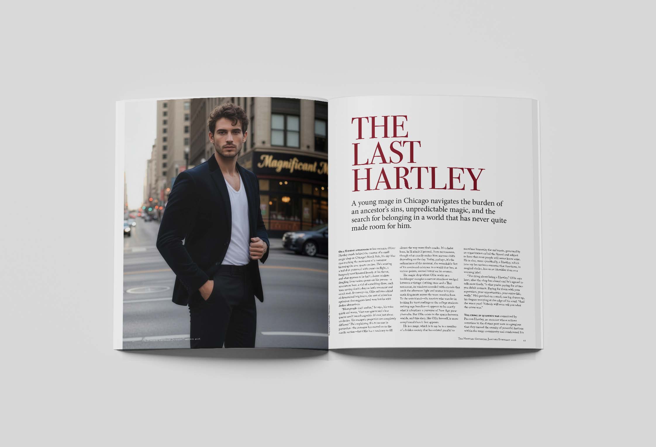
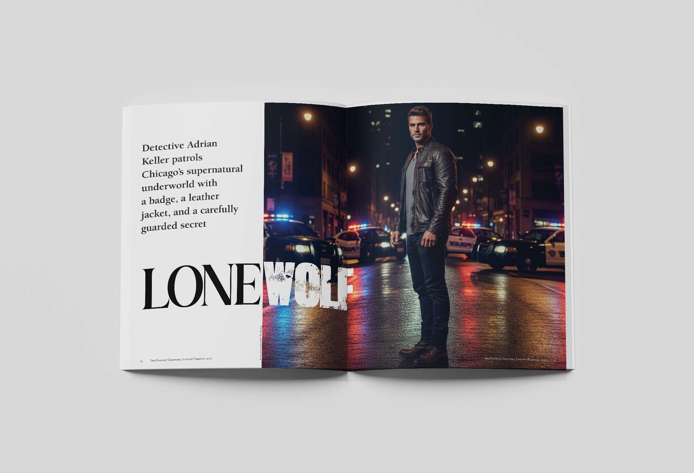
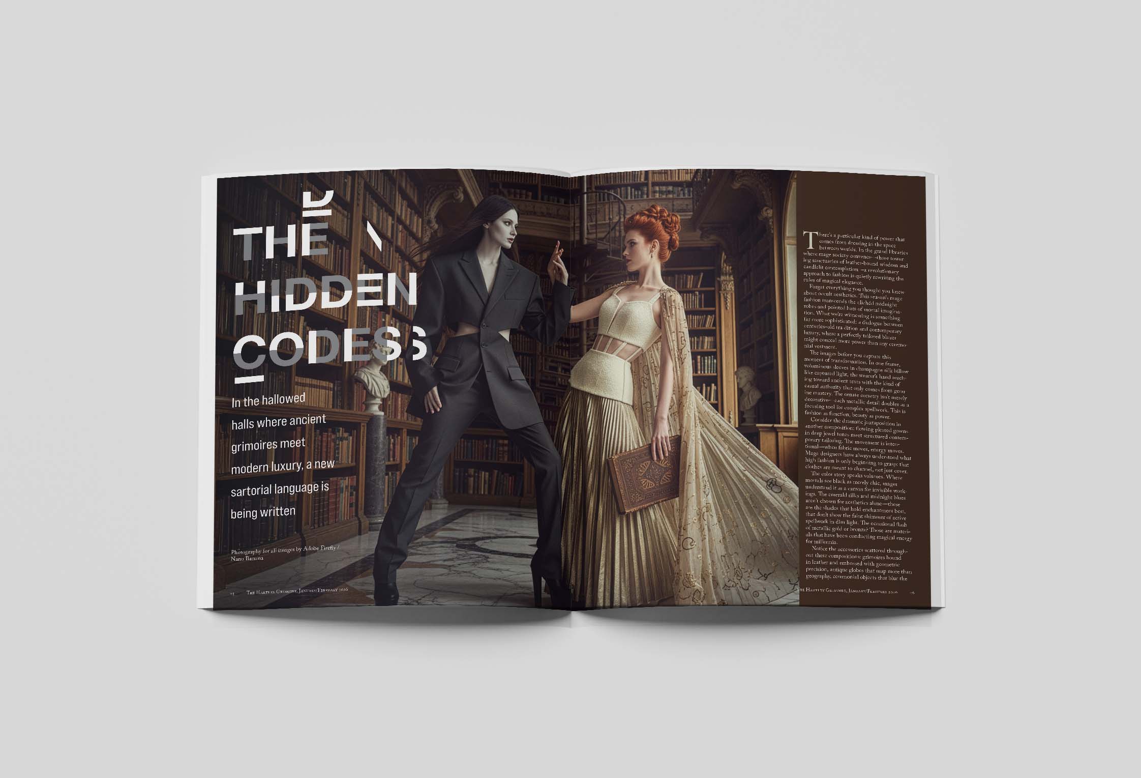
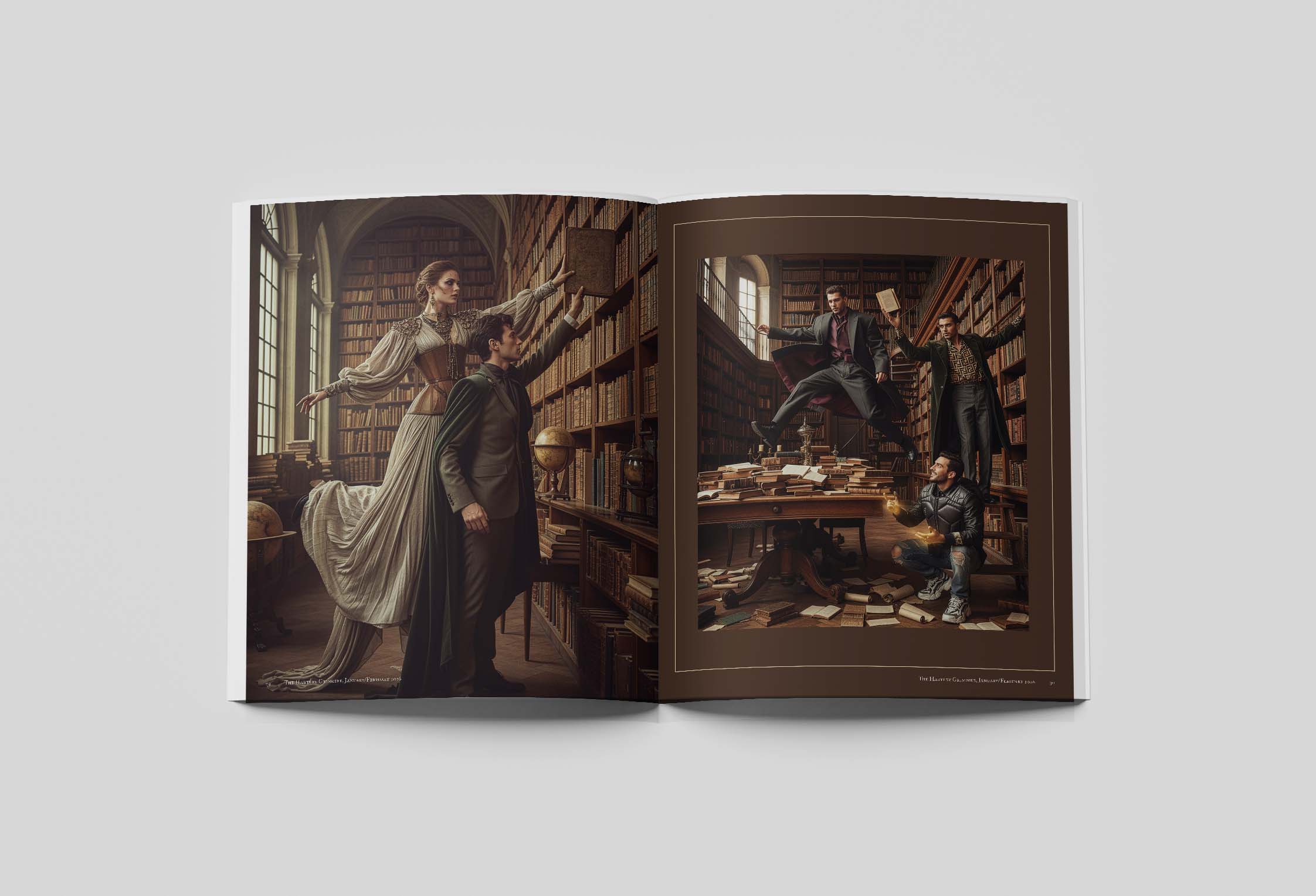
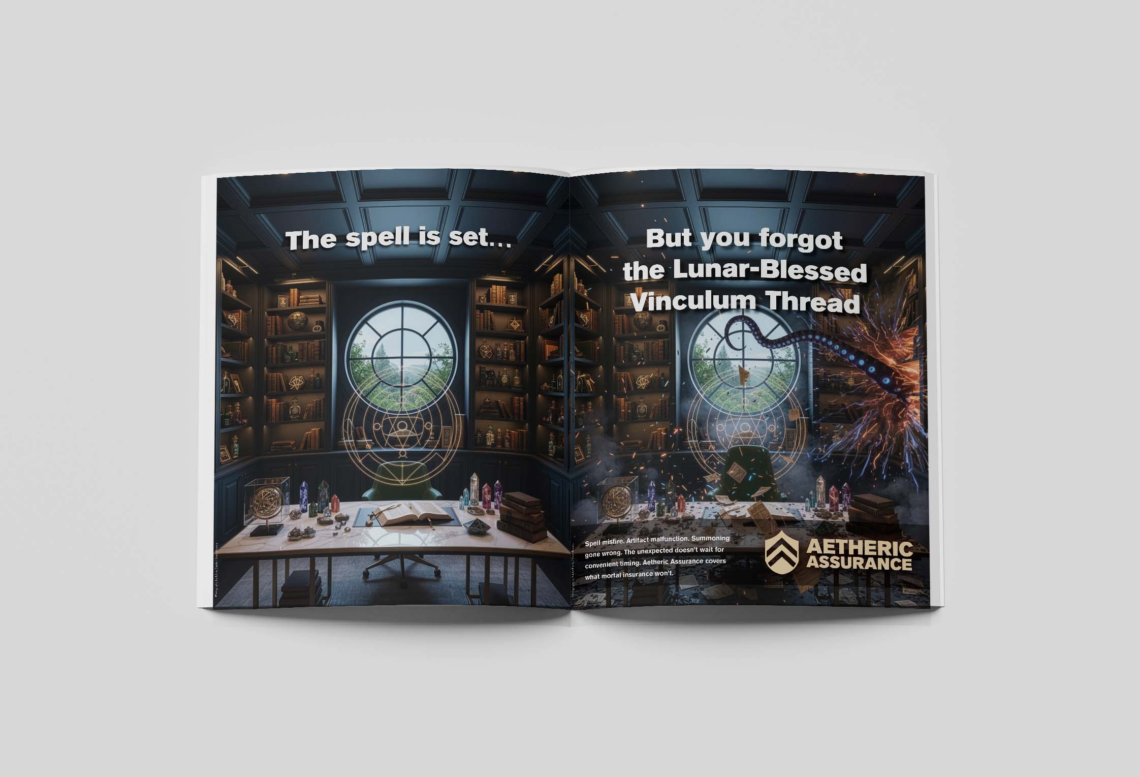
The Hartley Grimoire is a 23-page story-world magazine I designed for my own urban fantasy series, The Ritual of the Broken. It works two ways at once. For readers who've already finished the novel, it's a story bible disguised as a pseudo-academic occult journal, with character dossiers, in-universe essays, artifact entries and editorial features that expand the world. For readers who haven't bought the book yet, it's a 23-page sales pitch that doesn't read like one.
I built it as a newsletter incentive. Sign up for the email list, get the grimoire in your inbox. The first issue is dated January/February 2026 and treats the magazine as a real recurring publication inside the world of the story.
The aesthetic pulls from a few magazine traditions at once. There's the editorial polish of National Geographic and the typographic confidence of Wired. Enchanted Living contributes the occult-glossy mood, while TTRPG sourcebooks like Pathfinder bring the dense, encyclopedic delivery of lore. Holding all of that in one publication meant building a layout system that could carry feature spreads, single-column essays and quick-hit listicle pieces (yes, “Five Ways to Rid Your House of Demons” is in there) without losing the gothic, lived-in feel of the source material.
Target Audience
Two audiences sharing one publication. Existing readers of the novel, who want more of the world. And cold prospects (urban fantasy readers, MM fantasy readers, anyone shopping for their next series) who haven't bought a book yet. The design has to feel generous to one group and seductive to the other. Same pages, two jobs.
Touchpoints
The grimoire ships as a PDF newsletter incentive. Subscribers download it the moment they confirm signup. It also lives on the author site as a sample of what readers get when they join the email list. Print isn't the focus, but the file is laid out at print-magazine proportions so a future limited run isn't off the table.
Design Notes
Display type is set in Monnca, the same face used on the cover of The Ritual of the Broken, which ties the magazine visually back to the novel. Adobe Caslon handles body copy. Futura sits in between for section dividers and secondary titles. Atmospheric Chicago photography, candlelight, vellum textures and ink overlays do the heavy lifting on mood. The artwork for characters and creatures was generated through Adobe Firefly and Google's Nano Banana, then composited and treated in Photoshop to match the rest of the magazine's palette.
Success Metrics
Success for this piece is whether the magazine actually converts. Newsletter signups go up, and existing subscribers stay engaged enough to want a second issue. It's a recent project, so there's no launch data to report yet. As a portfolio piece, it's proof I can carry an editorial design across twenty-plus pages while keeping a consistent voice, palette and type system the whole way through. Long-form editorial is a different muscle than book covers, and this is the project that demonstrates it.