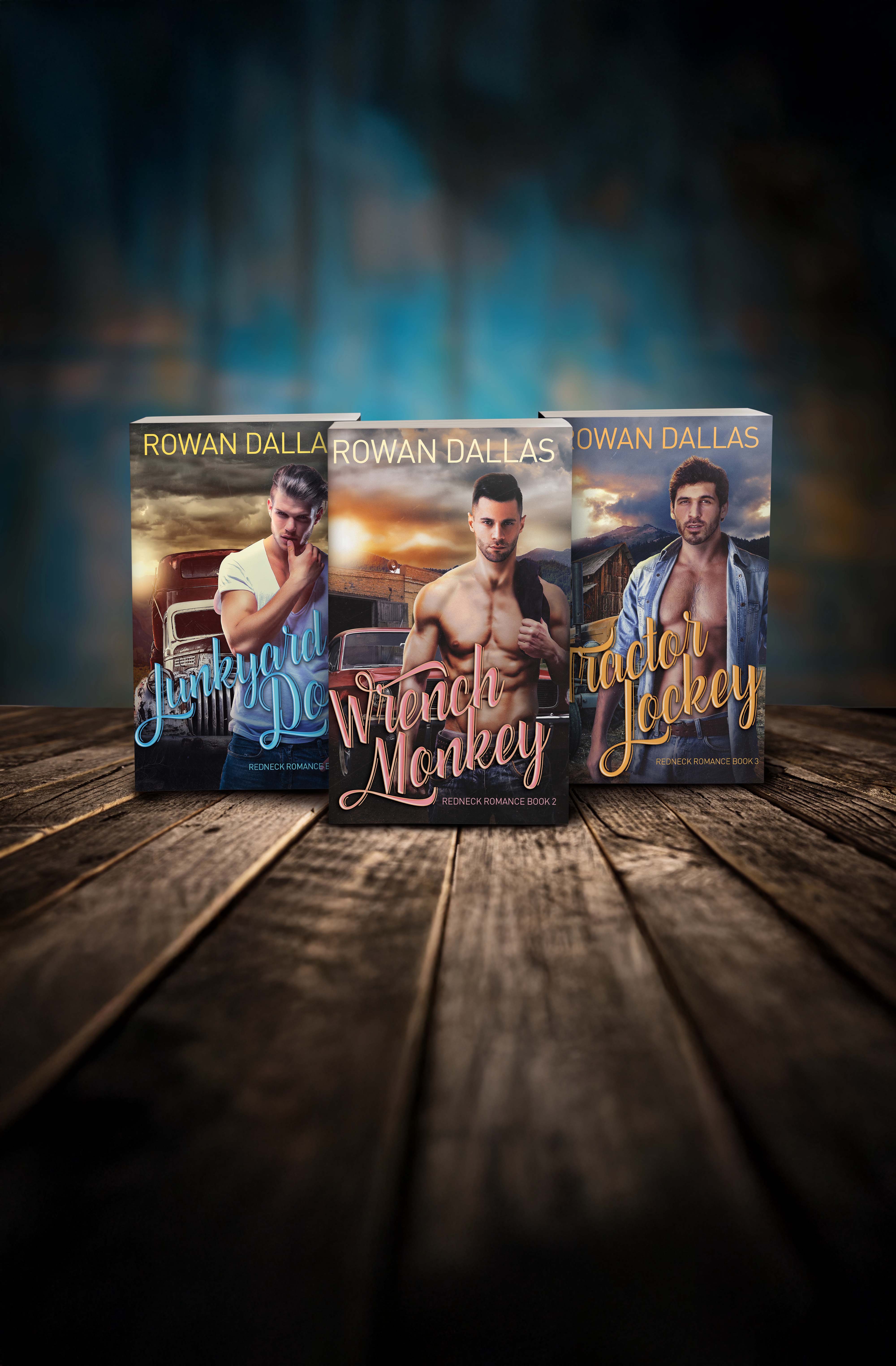
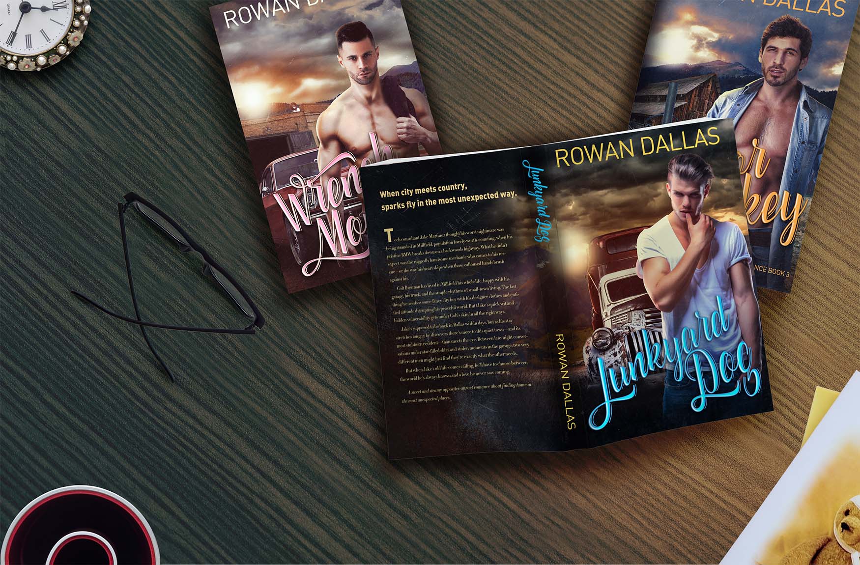
Redneck Romance
Redneck Romance

Book Cover Design

Book Cover Design

The goal of this project was to create a cohesive set of covers for the Redneck Romance trilogy, a small-town gay romance series. The covers needed to highlight the rural themes of the books while remaining competitive within the romance market. Each design emphasized rugged masculinity, rustic backdrops, and warm tones to match the themes of working-class romance and heartfelt storytelling.

Target Audience

The intended audience included readers of LGBTQ+ romance, particularly those drawn to contemporary small-town and rural-themed stories. The covers were designed to immediately signal the subgenre through character-forward imagery, bold title treatments, and rustic visual cues that resonate with romance readers browsing digital storefronts.

Touchpoints

The primary touchpoints included digital platforms (Amazon product pages, social media promotions) and print distribution. Cohesion across the trilogy ensured that readers could easily recognize the series as a whole, while each cover maintained enough individuality to stand out as a unique title. The consistent branding across these touchpoints created a professional, reliable look that helped build author identity.

Success Metrics

The trilogy launched successfully on Amazon, receiving strong initial sales and reader engagement. The client was very pleased with the covers and later hired me for additional design work, demonstrating both satisfaction and trust in the quality of the project.