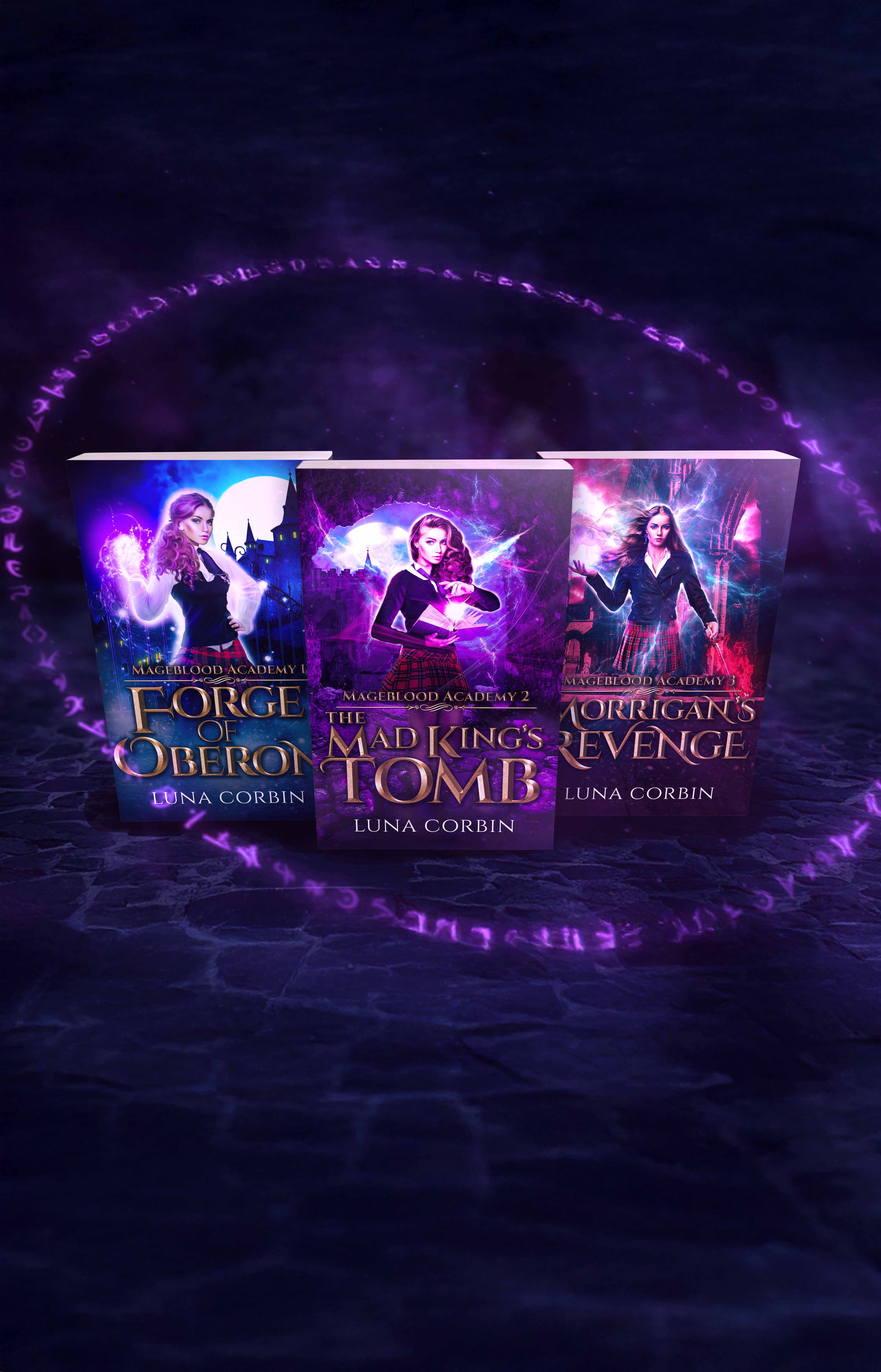
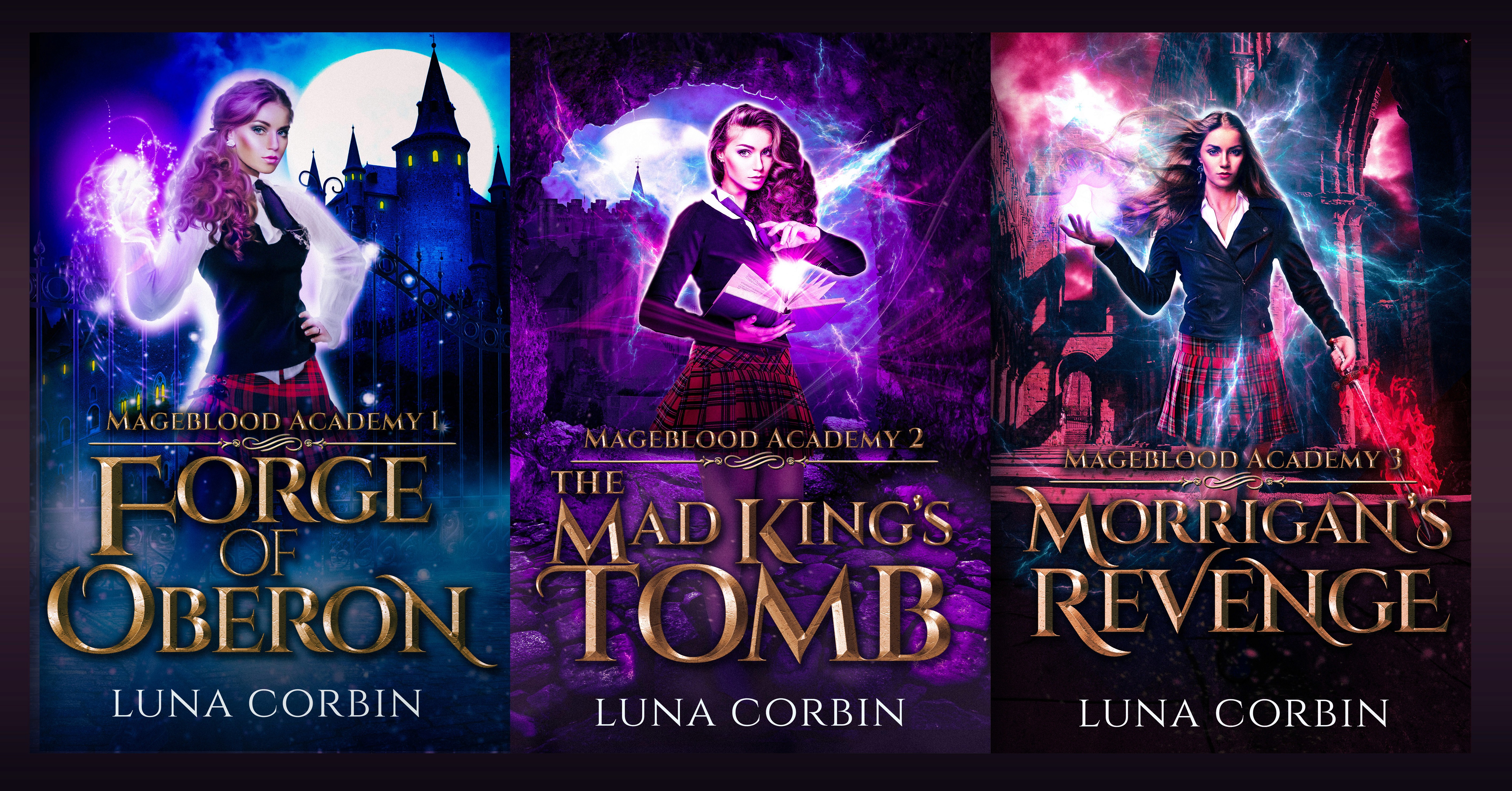
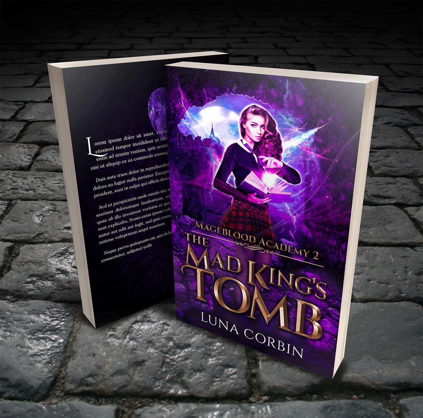
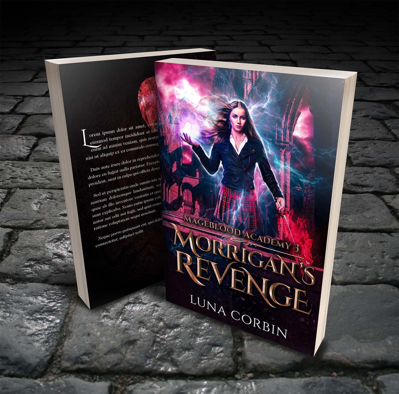
The Mageblood Academy trilogy is an urban fantasy academy series with a female lead. The job was three covers that read as a set without looking interchangeable. Series design lives or dies on this. Each book needs its own moment on the shelf, but a reader who finishes book one has to recognize book two on sight.
Target Audience
Fans of urban fantasy, academy fantasy and YA-leaning fantasy with a strong female protagonist. I leaned into the visual conventions readers expect (magical effects, bold display type, central character portrait) and tried to do them well rather than reinvent them. Genre readers want clarity. Cleverness can wait.
Touchpoints
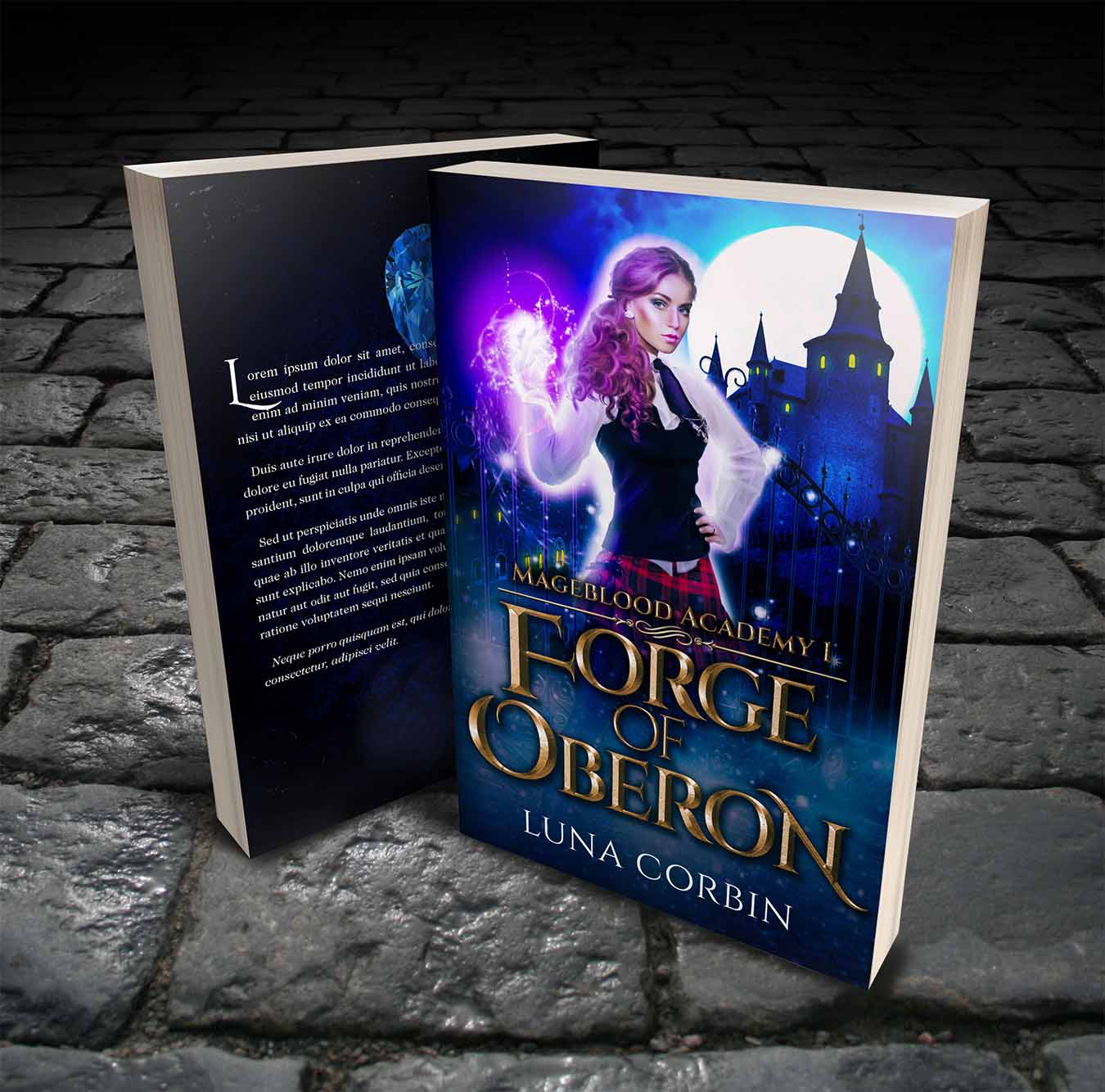
The books will sell mostly through digital storefronts, with print on demand as backup. The trilogy needed a unified system of color, typography and figure placement that holds together at thumbnail size on Amazon and on a paperback shelf.
Success Metrics
The trilogy hasn't been published yet, but the author was generous enough to let me include the work here. The client was happy with the final designs, which hit the genre marks and gave the series a real identity to launch with. Multi-book branding is a different beast from a one-off cover, and this project was a useful proof I can do it.