Lumina Learning Center
Lumina Learning Center
Logo Design
Logo Design

Project Overview
Lumina Learning Center is a conceptual rebrand. What started in 2019 as a small workshop series for writers and illustrators has grown into a full online platform with live classes, mentoring and school partnerships. The old identity, a stock lightbulb beside a wordmark, didn't reflect any of that.
The brief was tricky. Lumina needed to look like a real ed-tech company without losing the homemade, mentor-led feel that built their reputation in the first place. Too corporate and you alienate the eighteen-year-old signing up for her first illustration class. Too crafty and the school district won't sign the contract.
Lumina Learning Center is a conceptual rebrand. What started in 2019 as a small workshop series for writers and illustrators has grown into a full online platform with live classes, mentoring and school partnerships. The old identity, a stock lightbulb beside a wordmark, didn't reflect any of that.
The brief was tricky. Lumina needed to look like a real ed-tech company without losing the homemade, mentor-led feel that built their reputation in the first place. Too corporate and you alienate the eighteen-year-old signing up for her first illustration class. Too crafty and the school district won't sign the contract.
Target Audience
Aspiring creatives, ages 18 to 35, who want expert guidance without paying for an MFA.
Mid-career professionals, ages 30 to 45, looking for flexible skill-building.
Schools and arts orgs that need ready-to-teach creative curricula.
Aspiring creatives, ages 18 to 35, who want expert guidance without paying for an MFA.
Mid-career professionals, ages 30 to 45, looking for flexible skill-building.
Schools and arts orgs that need ready-to-teach creative curricula.
Brand Personality
Lumina is warm but professional. The whole pitch is that students get matched with mentors who actually care about their work. The voice has to back that up: encouraging, plain-spoken, never condescending. This isn't a place that talks down to beginners.
Lumina is warm but professional. The whole pitch is that students get matched with mentors who actually care about their work. The voice has to back that up: encouraging, plain-spoken, never condescending. This isn't a place that talks down to beginners.

Design Elements
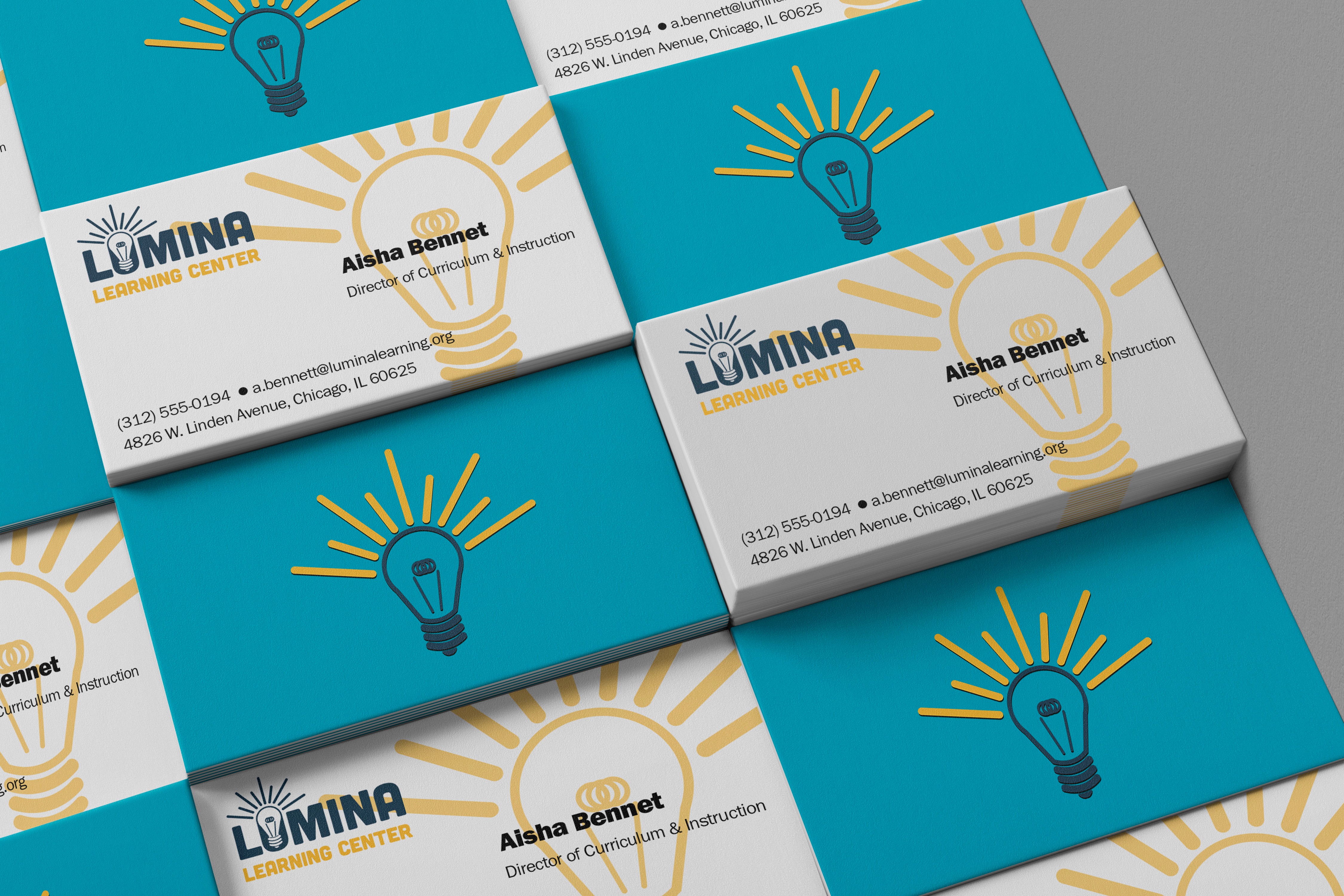
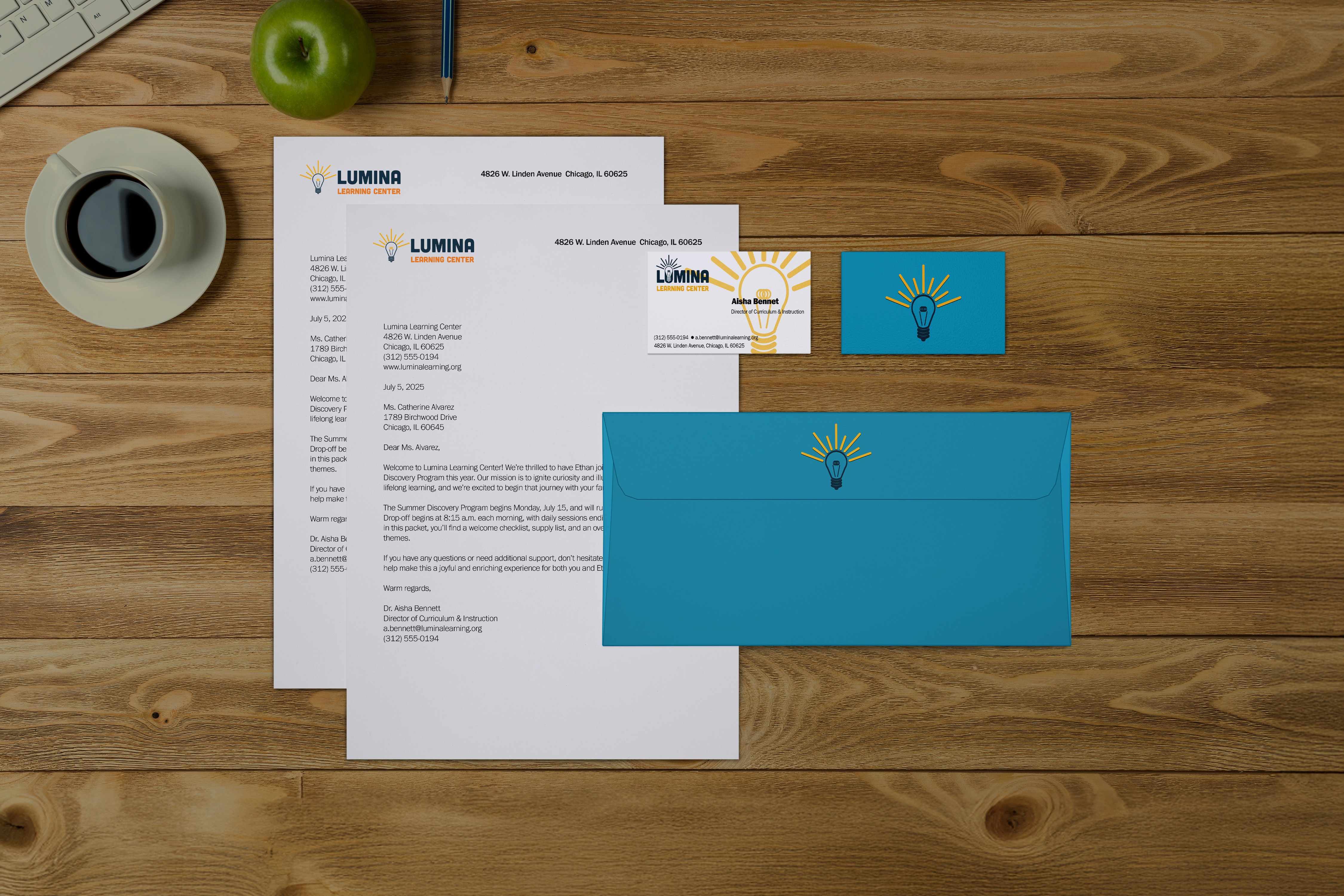
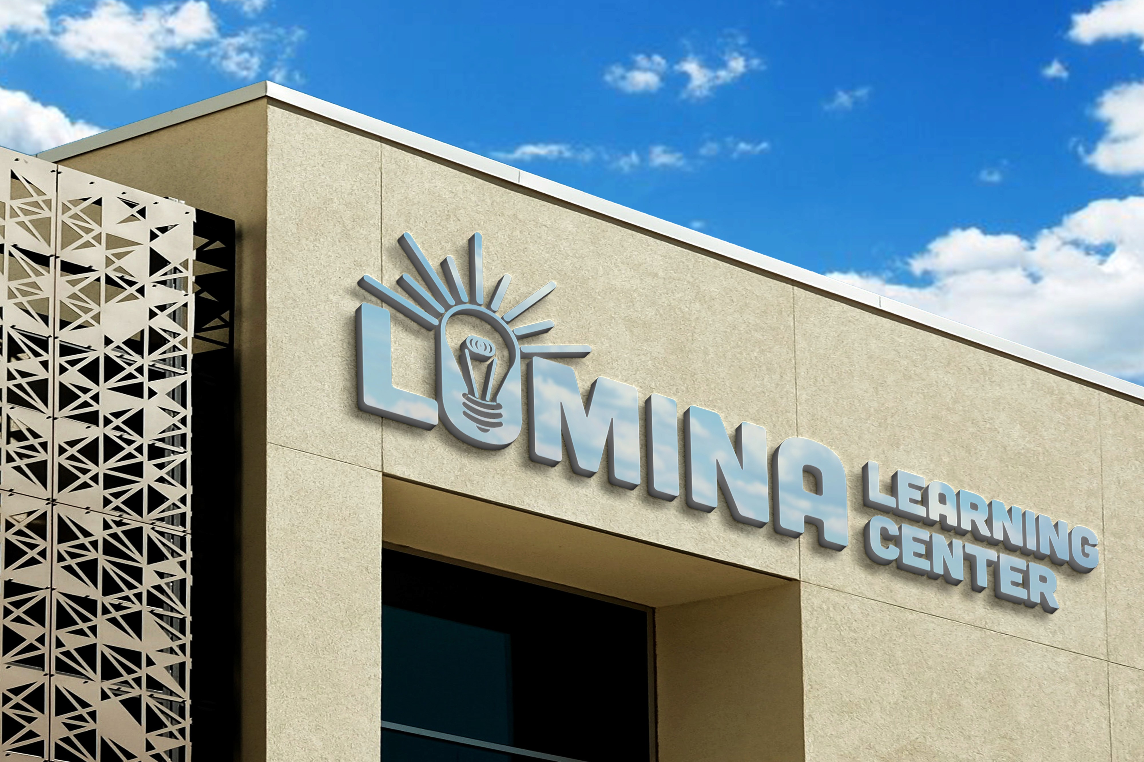
The original logo was a generic lightbulb and wordmark. I kept the lightbulb because it's still the right idea. I just executed it with more care. The geometry is cleaner, the wordmark sits properly with the mark and the whole thing scales down to a 16-pixel favicon without falling apart.
The original logo was a generic lightbulb and wordmark. I kept the lightbulb because it's still the right idea. I just executed it with more care. The geometry is cleaner, the wordmark sits properly with the mark and the whole thing scales down to a 16-pixel favicon without falling apart.